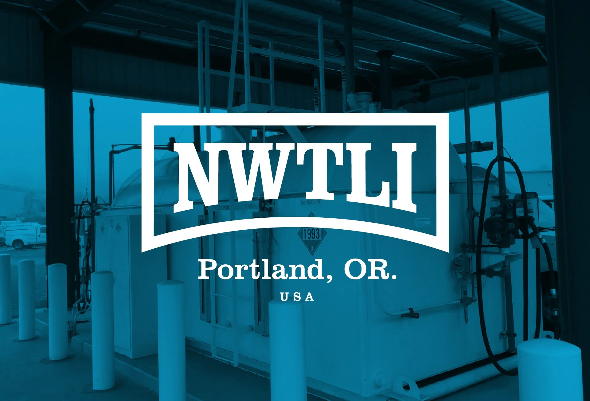
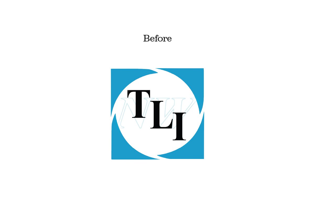
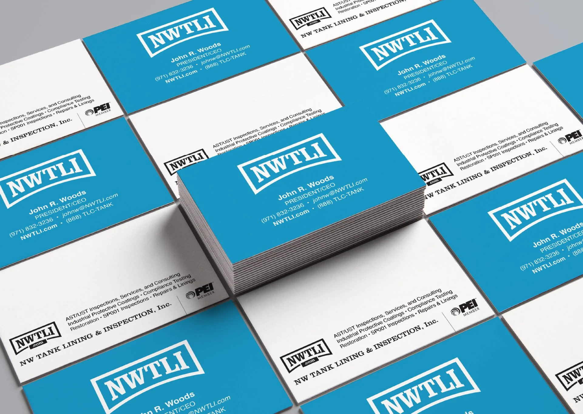
NWTLI is a commercial tank lining & restoration company based out of Portland, Oregon. They have been providing full-service work—such as Coatings, Linings, Inspections, and Restorations—to their customers since 1959. I was tasked with updating their logo to something more relevant and modern while retaining the look and feel of a commercially based company.
TYPOGRAPHY
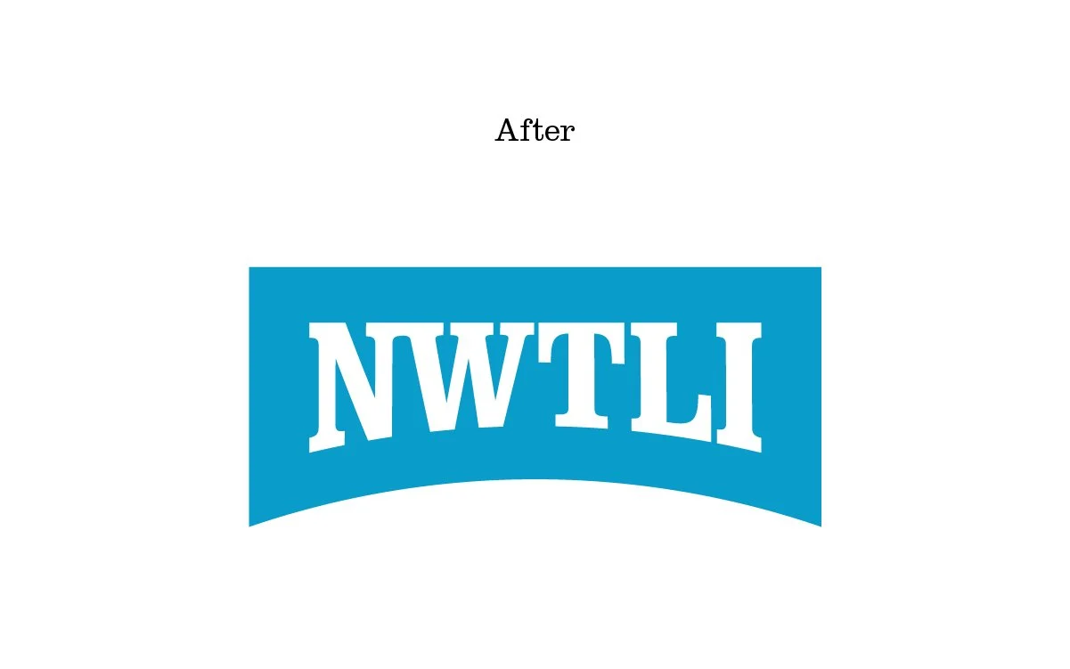
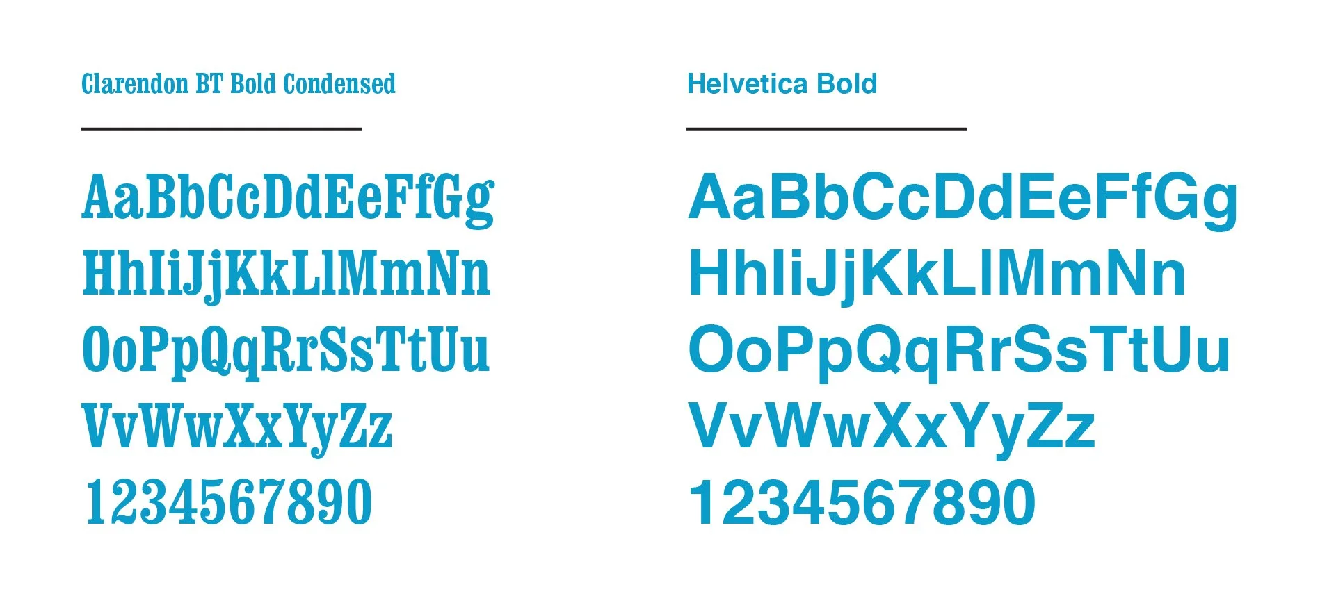
Clarendon, a slab-serif typeface designed in 1865, was chosen as the typeface for the logo for a couple of reasons. For one, It is a favorite of mine and I’m a firm believer in working with what you know—but also because it has a strong commercial feeling to it. NWTLI isn’t a modern, hip coffee shop or a tech company, they’re a commercial business that restores and inspects industrial grade underground tanks. They required a typeface that felt solid, bold, and no nonsense.
Similarly l chose Helvetica for the other elements because it’s a workhorse that does what you need it to do, without being flashy.
COLOR
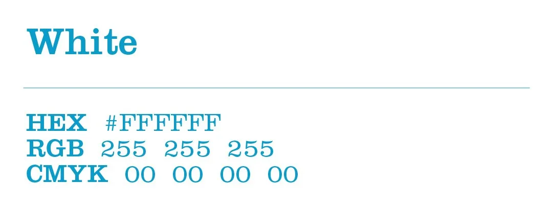
The specific hue that NWTLI uses is representative of the blue paint they use inside the tanks when they get restored. While that hue may shift from maker to maker, we kept a color that they are known for. The original logo had it, and I made some subtle tweaks and gave them set HEX, RGB, and CMYK values.


Brand Extension
Like any good brand, big or small, getting their logo on other things is important. Especially a company like NWTLI, they need to have their branding on shirts, trucks, paperwork, buildings, etc. as most new work spreads by word of mouth. Below are a few mock-ups of things I created to show how their logo could work in different environments.
